Sit on a retail shelf surrounded by dozens of competitors, and a wine bottle has roughly three seconds to earn a second look. That window belongs almost entirely to the label. It works as a silent sales rep, doing branding, storytelling, and shelf positioning long before anyone reads a tasting note.
Why The Bottle Sells Before The Wine Does
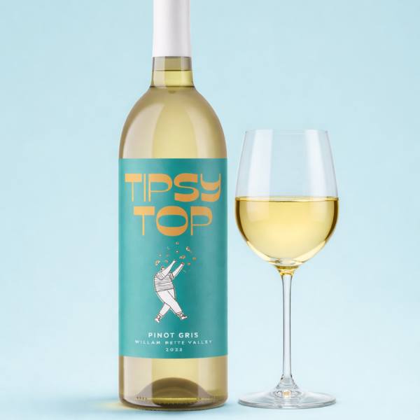
The Quiet Pull Of Shelf Presence: Wineries spend years perfecting their blends, yet the bottle does most of the talking long before the cork comes out. Custom wine bottle labels carry the weight of recognition, story, and price perception in one small surface. A confident design hints at what’s inside without overselling, which is exactly what curious buyers tend to respond to.
Surviving The Ice Bucket Test: Wine often ends up chilled, condensation-soaked, or buried in ice for hours on end. That is where waterproof labels quietly prove their worth, holding crisp print and edges intact when untreated paper would warp or peel. Smooth paper finished with protective laminate keeps a wine looking premium from cellar door to dinner table.
What Buyers Read Before They Read The Bottle
The Hidden Driver Behind Pick-Up Rates: Wineries chasing stronger customer engagement on shelf often find the lift comes from the label rather than the liquid inside. Buyers respond to bottles that feel approachable, with clear hierarchy and a tone that matches their mood for the night. A label that reads instantly tends to convert browsers into pickers far quicker than one demanding study.
Small Details That Carry Big Weight: Beyond colour, plenty of subtle cues shape how a bottle gets read on the shelf, even by shoppers who consider themselves casual. Smaller decisions often matter more than the obvious ones, particularly for buyers comparing similar price points and styles in the same aisle. A few of the quiet workhorses doing real work include:
- Origin badges that ground the wine in a specific region
- Vintage typography placed where the eye naturally lands
- Texture and laminate choices hinting at price tier and craft
- Back-label tasting notes written in plain, inviting language without jargon
When Premium Production Quietly Changes Everything
Where Craft Meets Print: Even a beautifully designed label can fall flat if the print quality lets it down at the last step. Typography hierarchy only does its job when the print reproduces tiny serifs, fine lines, and varied weights without bleed or blur. Sharp print on uncoated stock gives premium wines that handmade feel buyers expect at higher price points.
The Customisation Advantage Wineries Quietly Use: Custom label printing partners now help wineries push past the generic bottle look that hurts smaller producers most. The result is presentation quality that competes with much larger brands on the same shelf.
Letting The Label Do The Heavy Lifting
Treating the label as decoration leaves serious marketing power on the table, and savvy wineries already know it. Smart design, custom printing, and the right material choices can shift a bottle from overlooked to first pick on a crowded shelf. To explore creative, premium-finish wine label options made for Australian wineries, request a quote today.
Featured Image Source: https://docs.google.com/document/d/1PNTM-exavASxBBlmhS5VLFvt6WkVHOgg8tto7guF3M8/edit?usp=drive_link